Description
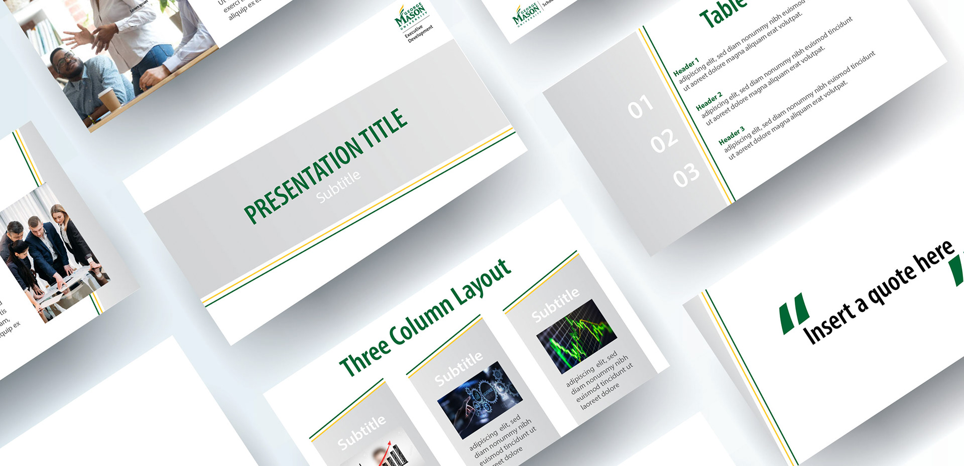
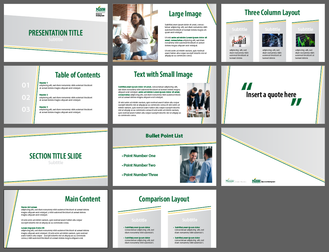
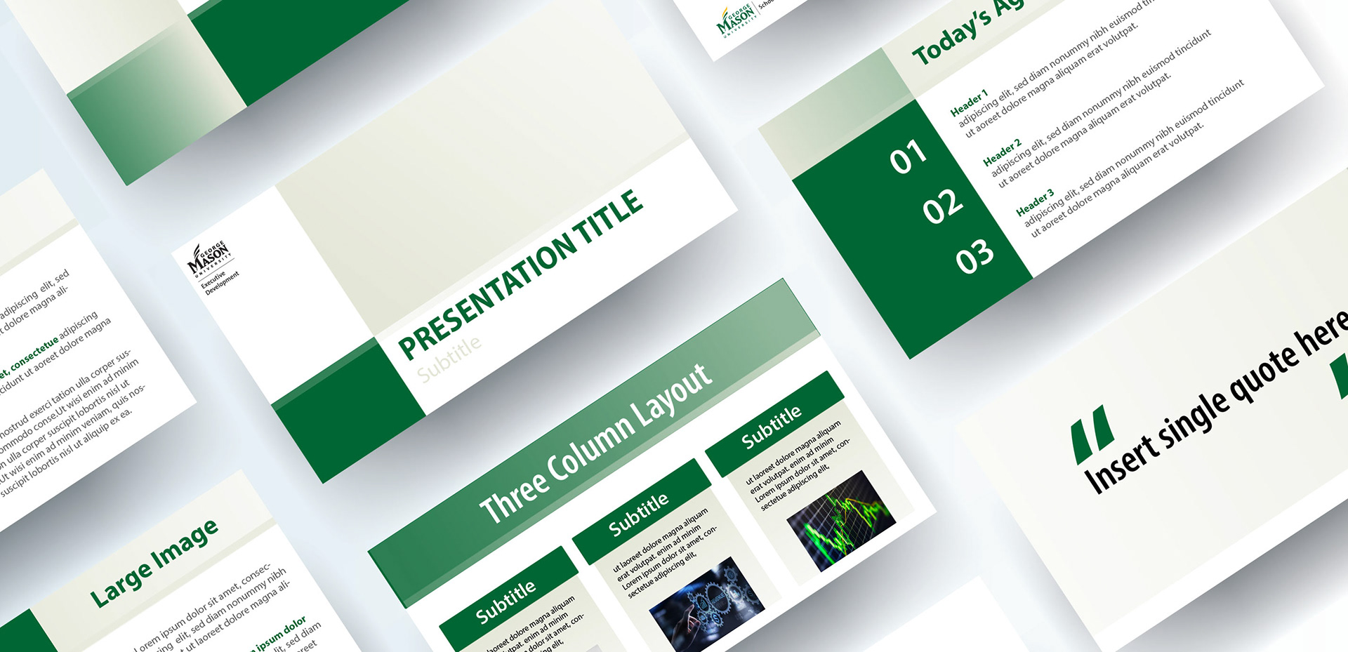
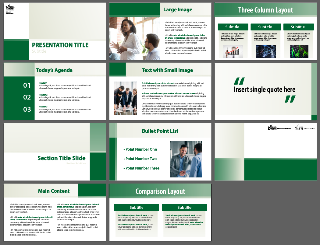
As a freelance graphic designer, I created two PowerPoint presentation templates for George Mason University School of Business Executive Development. These templates would replace older files that were outdated and overly busy. My goal was to create a slideshow that was more unique than standard PowerPoint slides, but more importantly, functional for teachers to input their own content. The slides were required to use GMU branded colors, fonts, and stylistic themes.
My Process
Any creative process should begin with intense research, which is where I chose to begin this process. I quickly realized that the most important part of this project would be ensuring that my designs would allow professors to easily alter the templates to their content and needs. I believe that any piece of design needs to be functional first.. If a product is beautiful, but not usable, then the product has failed. I gave my templates lots of open areas to allow for high volumes of content. Small points of intrigue and detail were placed in key points in order to keep the slides interesting during the presentations. The grey slides are meant to have a fun, energetic mood created by using dynamic diagonal lines and lighter colors. The tan slides have a more serious, professional tone with a ridged structure created by the geometric, block forms.
